Olive Crush
February 3rd, 2010 in illustration, pruple, texture by Ronnie
Olive Crush is a web design and development studio that offers the usual services. The website design is beautiful with excellent use of textures and illustrated characters and elements that were made to look like cut-outs.
CONTINUE READING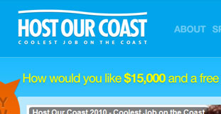
Host Our Coast
February 3rd, 2010 in blue, illustration by Ronnie
Modeled after the extremely successful "Island Reef Job" tourism promotion created by Tourism Queensland, users can submit their application to this website where the winners will be a travel journalist promoting tourism in Queensland. The design is great and has illustrated nature elements from Photoshop brushes.
CONTINUE READING
namastec
February 3rd, 2010 in black, brown, illustration, texture by Ronnie
Namastec is a website design and development services company located in Nebraska. They offer various services like customized web design, development, and web marketing solutions. The design uses a dark color scheme with brown and black. Subtle use of nature related textures on the design.
CONTINUE READING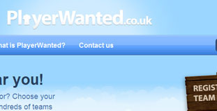
Players Wanted
February 2nd, 2010 in grass, green blue, illustration by Ronnie
Nice and beautiful illustration of nature elements. The design is crisp with a clean layout. PlayerWanted.co.uk is a unique free service for all sports which gives players the chance to find a club or team in their area in their preferred sport and enables coaches and managers to post adverts for new players.
CONTINUE READING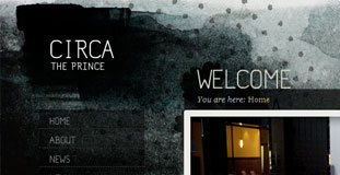
Circa the Prince
February 2nd, 2010 in grunge, illustration by Ronnie
The design has a grunge look with use of nature texture and illustration. Circa, the Prince is a dining and drinking restaurant based on Melbourne. Recently re-opening after a major refurbishment, Circa now has a new sense of laid-back luxury; where a relaxed, convivial aesthetic interplays with a versatile use of space, offering even more options to enjoy a range of food and wine experiences.
CONTINUE READING
West Coast Design Co
February 2nd, 2010 in illustration, paper, texture by Ronnie
A website for web designers and developers from Canada. Their website is very cleanly designed with a clear layout. There are simple nature illustrations in the background and the use of textures gives the website an organic feel. They claim that their designs and solutions are inspired by nature.
CONTINUE READING
Storenvy
January 30th, 2010 in illustration, landscape by Ronnie
Storenvy is a social online store and shopping community website. Users can sign-up and setup an online store for free. Users can also shop on different stores at once while interacting with other users. The design has a very bright nature feel with subtle use of texture and a nicely illustrated nature scene in the background.
CONTINUE READING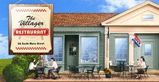
Villager Restaurant
January 29th, 2010 in illustration, texture, wood by Ronnie
A website for a restaurant in Kent, Connecticut. They offer breakfast and brunch meals as well as Mexican dishes. The design has a nice illustrated nature landscape in the background and the header is an illustration of their restaurant. The design also used some wood and ribbon texture.
CONTINUE READING
Yoshinoya Singapore
January 29th, 2010 in animation, flash, illustration by Ronnie
A very fun and colorful flash website. Simple cartoon and nature illustrations with interactive animation. It's a website for a Japanese restaurant in Singapore offering various traditional Japanese foods.
CONTINUE READING
Foxtie
January 27th, 2010 in black, brown, illustration, texture by Ronnie
A beautifully designed website with crisp design elements and excellent use of textures with a very user friendly layout. The design also features character illustrations. They are a design agency specializing in the creation of interactive websites, unique brands, crisp print material, and innovative marketing campaigns.
CONTINUE READING
Chirp
January 21st, 2010 in blue, clouds, illustration, Twitter by Ronnie
The website for the official Twitter developers conference to be held in San Francisco. Nice use of nature textures with hand drawn illustrations and catoonish theme.
CONTINUE READING
Adobe User Group Netherlands
January 19th, 2010 in blue, illustration, mascot, white by Ronnie
A very colorful and fun website with nice illustration of nature and mascots on a textured background. Design elements are crisp with subtle use of drop shadows and gradients. A really fitting website for the Adobe Users Group in Netherlands.
CONTINUE READING


