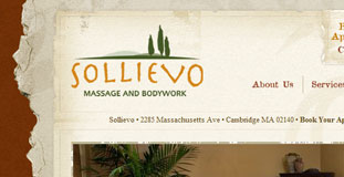
Sollievo
February 18th, 2010 in paper, texture, torn by Ronnie
Great use of texture and web elements that are nature inspired. The torn paper edged texture that served as the content background looks great. Sollievo is a spa that offers massage therapy and acupuncture.
CONTINUE READING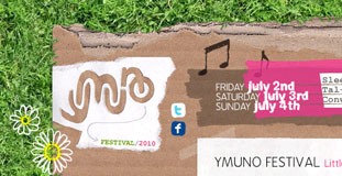
Ymuno Festival 2010
February 17th, 2010 in grass, paper, texture by Ronnie
Lost of use of nature textures in this design gives this design a unique look. The design is also in theme with the topic of the website. Ymuno Festical is a small festival held every year at Sleepy Meadow on the banks of the river Conwy. The festival is all about like minded communities meshing and melting together, having a big knees up and enjoying some great connections, chilled vibe, quality food and fantastic music.
CONTINUE READING
Master of Malt
February 17th, 2010 in brown, texture, wood by Ronnie
Great use of textures in this design with a very usable layout. The two textures used really goes well together and fits the theme of the site. Master of Malt is a whisky retailer for 25 years.
CONTINUE READING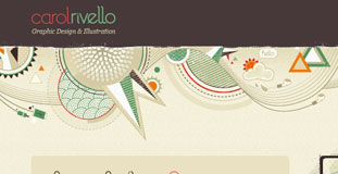
Carol Rivello
February 17th, 2010 in cream, Purple, texture by Ronnie
Beautiful design with a very nice color scheme and use of nature texture. The colorful decorative illustrations in the design and subtle animations makes the website even better. This website is a portfolio website from a graphic designer from Brazil.
CONTINUE READING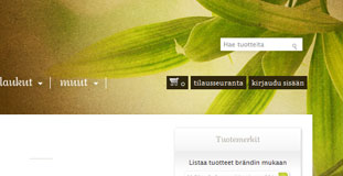
Yalo
February 15th, 2010 in brown, leaves, texture by Ronnie
Yalo is a website that sells clothing items that are mostly recyclable and made from organic materials. The design is nice and simple with the use of paper texture and nature inspired photos. The website has a very organic feel.
CONTINUE READING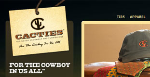
Cacties
February 15th, 2010 in brown, photgraphy, texture by Ronnie
Cacties was created to design and manufacture straightforward American lifestyle products of very high quality for that person who identifies with the values and heritage of the American west. The big photo of a nature landscape in the background gives this website a western feel.
CONTINUE READING
dzucle
February 15th, 2010 in brown, dark, texture, wood by Ronnie
This design has great use of texture and illustration. The web elements are crisp and nicely done and color scheme used is perfect for the theme. Dzucle is a portfolio website for a web designer from Hanoi, Vietnam.
CONTINUE READING
Stop Child Labor
February 12th, 2010 in blue, brown, paper, texture by Ronnie
Very creative design with nature inspired textures and color scheme. The continent of Africa is made to look like it was made from torn paper pieces. Stop Child Labour – School is the best place to work is a joint lobby, education and awareness raising campaign that seeks to eliminate child labour through the provision of full-time, formal and quality education.
CONTINUE READING
Eliminate Paper Time Cards
February 12th, 2010 in brown, paper, texture by Ronnie
This design has a very organic feel to it with lots of use of paper texture in the navigation and background. Eliminate Paper Time Cards is a campaign website to stop using paper time cards and switch to electronic time keeping methods instead.
CONTINUE READING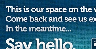
Phynk Creative
February 12th, 2010 in blue, grass, green, texture by Ronnie
A very high-contrast color scheme. It's a coming soon website for a design agency. Nice use of texture in the design with big typhography.
CONTINUE READING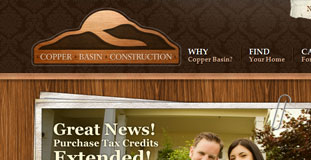
Copper Basin Construction
February 12th, 2010 in brown, texture, wood by Ronnie
Copper Basin is a construction company that started building homes in 1995. Copper Basin's current focus is the Inland Northwest, with communities throughout the Eastern Washington and North Idaho region. The design looks with great with the balanced use of wood and paper texture
CONTINUE READING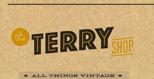
The Terry Shop
February 12th, 2010 in brown, texture, vintage by Ronnie
The Terry Shop is a website for just two friends that collect and sell vintage items. The design is very simple and has an organic feel. The use of the cork board texture is a nice touch.
CONTINUE READING


