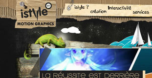
iStyle
September 2nd, 2010 in flash, grunge, texture by nature-website-gallery
A one page layout website with a bit grunge feel using torn cardboard textures. iStyle is a multimedia design company based from France.
CONTINUE READING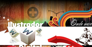
Ilustrador Digital
August 21st, 2010 in animation, flash, texture by nature-website-gallery
The design has a dark color scheme with subtle use of nature texture and other 3d elements. Ilustrador Digital is a design agency from Brazil.
CONTINUE READING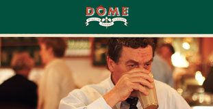
Dome Coffees
August 11th, 2010 in flash, paper, texture by nature-website-gallery
A simple design with minimalistic look using green and brown as the main colors of the website. Dome Coffee is a coffee shop that is more than 20 years old.
CONTINUE READING
Zillu
July 22nd, 2010 in animation, flash, illustration by nature-website-gallery
A unique design with flash animation to entice the visitor to send a message. A message form shows when you click the monkey. Zillu are a forward-thinking web development agency, specialising in Ecommerce.
CONTINUE READING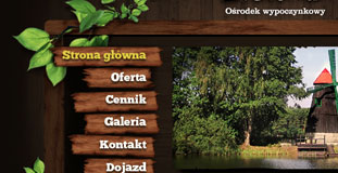
Green Recreation Center
July 13th, 2010 in animation, flash, illustration by nature-website-gallery
A very nature inspired layout with illustrated textures and a simple flash animation in the header. Green Recreation Center is a resort situated in a beautifully located place around the forests and lakes.
CONTINUE READING
Ek and Green
July 7th, 2010 in blue, flash, illustration, sea by nature-website-gallery
The design used a mix of html and flash to show some interesting animation effects. Ek & Green is an advertising agency in Stockholm
CONTINUE READING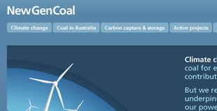
New Gen Coal
June 27th, 2010 in animation, flash, illustration by nature-website-gallery
The design used flash animation on the homepage and has very well thought layout design which makes the website easier to read. This website teaches about the complex issues of climate change, and the important role coal power plays.
CONTINUE READING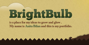
Bright Bulb Studio
June 20th, 2010 in animation, flash, illustration by nature-website-gallery
Clear and easy to use layout with textured illustrations and simple animation on the header. Bright Bulb is the online portfolio of web designer Anita Bilan.
CONTINUE READING
Rubbik
May 19th, 2010 in animation, flash, illustration by nature-website-gallery
Beautiful design with really cool animation in the header. The footer features great looking nature inspired illustrations.
CONTINUE READING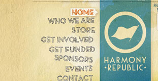
Harmony Republic
March 16th, 2010 in flash, paper, texture by nature-website-gallery
A flash website with amazing use of nature inspired textures made the design look organic and Earth friendly. Harmony Republic is a nonprofit that fosters the development of art by supporting and promoting emerging music, film literature and visual artists who make a positive impact on society.
CONTINUE READING
Young Americans
March 9th, 2010 in animation, blue, flash, green by nature-website-gallery
With the mix of a fun interactive town and a bright, friendly design, this site is a great example of well executed web design. Young Americans Center for Financial Education is home to Young Americans Bank and an incredible array of award-winning nonprofit programs, all designed to teach young people 21 and under about finances, economics and business.
CONTINUE READING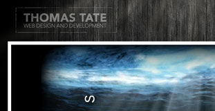
Rethinking Code
March 4th, 2010 in animation, flash, paper, texture, wood by nature-website-gallery
Excellent use of wood and paper textures in the design. The flash animation in the header looks great and gives a very mysterious feel. Rethinking Code is the online portfolio of Thomas Tate, a web designer/developer.
CONTINUE READING
