
Przeznaczenie
March 13th, 2010 in dark, grunge, texture by nature-website-gallery
Really dark and grunge looking design with excellent use of paper texture that fits the theme of the TV series which is crime and suspense. Destination is a TV series in Poland
CONTINUE READING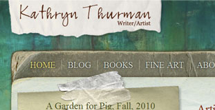
Kathryn Thurman
March 10th, 2010 in grunge, paper, texture by nature-website-gallery
Grunge looking design with colorful color scheme. Lots of use of paper texture and painting effects. This is a homepage for an artist from San Juan Islands.
CONTINUE READING
Lucid Crew
February 9th, 2010 in brown, grunge, texture by nature-website-gallery
Lucid Crew is a full-service web design and development company based in Austin, Texas that has been in business since 1999. Their website has a grunge feel with proper use of paper texture to give the site an organic feel.
CONTINUE READING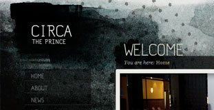
Circa the Prince
February 2nd, 2010 in grunge, illustration by nature-website-gallery
The design has a grunge look with use of nature texture and illustration. Circa, the Prince is a dining and drinking restaurant based on Melbourne. Recently re-opening after a major refurbishment, Circa now has a new sense of laid-back luxury; where a relaxed, convivial aesthetic interplays with a versatile use of space, offering even more options to enjoy a range of food and wine experiences.
CONTINUE READING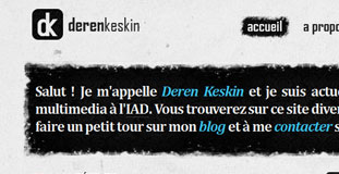
Deren Keskin
January 15th, 2010 in black, grunge, texture, white by nature-website-gallery
Nice mix of different textures in the design. A portfolio/blog site that has a grunge/organic feel.
CONTINUE READING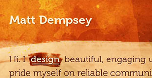
Matt Dempsey
December 28th, 2009 in brown, brush, grunge by nature-website-gallery
Cool organic looking design
CONTINUE READING
Shakespeare Course
December 28th, 2009 in blue, grunge, texture by nature-website-gallery
This design uses nature inspired texture for an organic feel
CONTINUE READING


