Twenty Feet
June 12th, 2010 in Clean, illustration, light by Green
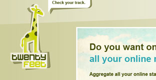
TwentyFeet is a service that will help you keep track of your social media activities and monitor your results. Their website design features simplistic illustration of a nature scene featuring a giraffe, their mascot.
CONTINUE READING
Joby
June 12th, 2010 in illustration, texture, wood by Green
Very nice looking color scheme with subtle use of paper and wood. Joby is a freelance web designer.
CONTINUE READING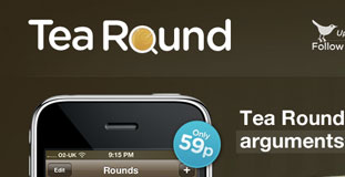
Tea Round App
June 12th, 2010 in brown, illustration, texture by Green
A sleek looking design with highly detailed web elements coupled with great looking illustration. Tea Round App is an iPhone app that makes determing who should make the tea easier.
CONTINUE READING
My Brain Art
June 12th, 2010 in illustration, paper, texture by Green
A very lively design filled with illustrations and with use of paper texture. My Brain Art is the portfolio website of Vasjen Katro.
CONTINUE READING
Estudio Oapo
June 11th, 2010 in illustration, paper, sketching, texture by Green
Estudio Oapo is a web design agency based in Brazil. The layout is very unique and the whole website is designed to be navigated horizontally.
CONTINUE READING
Bazar Solidarity
June 10th, 2010 in illustration, light by Green
A light and clean layout with colorful illustration of nature and kids. Bazar Solidarity is a non profit organization that help kids by selling items on the internet.
CONTINUE READING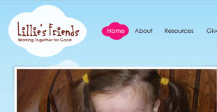
Lilie’s Friends
June 10th, 2010 in bright, illustration, pink by Green
The design uses bright color scheme with simple illustration of a nature scene. Lillie's Friends is a website that raises awareness about neuroblastoma.
CONTINUE READING
Clickfarm Interactive
June 7th, 2010 in illustration, texture by Green
A simple layout and design with use of textures on different parts of the website and has very distinct country farm look. Clickfarm Interactive is a web design studio based from Kansas
CONTINUE READING
Meomi Cloud House
June 7th, 2010 in animation, illustration by Green
A very unique design, definitely not what you see with modern websites and it has a 90's feel but that's what makes it look great. Meomi Cloud House is a small design studio based in Vancouver and Los Angeles.
CONTINUE READING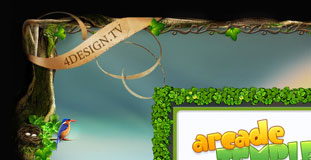
4design
June 7th, 2010 in fantasy, illustration by Green
Great looking design set in a fantasy scene with detailed illustration of nature elements. 4design is a web design agency based in Belgium.
CONTINUE READING
Nutrifield
June 6th, 2010 in animation, illustration, texture by Green
The design used flash for a product presentation and animation. The design also has textures and illustration for an organic nature feel. Nutirfield sells various gardening supplies.
CONTINUE READING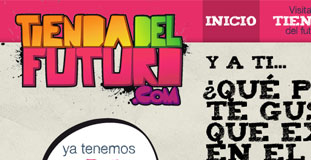
Tienda del Futuro
June 6th, 2010 in colorful, illustration, texture by Green
A very colorful design filled with illustrated web elements and lots of use of paper texture. Tienda del Futuro is a technology blog in Spanish language.
CONTINUE READING


