La Masa Mimatta
April 23rd, 2010 in paper, texture, wood by Green
Excellent use of textures all over the website which gives a great effect. La Masa Mimatta is a pizza restaurant.
CONTINUE READING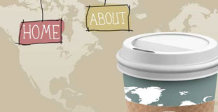
C and C Cofee Company
April 21st, 2010 in illustration, paper, texture by Green
Great effect using animation, paper texture and hand drawn web elements. C and C Coffee located on the square of Chambersburg, Pa.
CONTINUE READING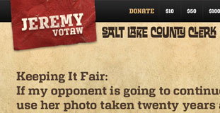
Jeremy Votaw
April 21st, 2010 in paper, texture by Green
Simple layout design with minimal use of paper texture in the background and excellent color scheme. This is the campaign website of Jeremy Votaw
CONTINUE READING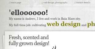
HM Andrei
April 21st, 2010 in illustration, paper, texture by Green
Amazing use of typography and layout design with subtle use of paper texture on the background. This is a portfolio of a web designer and photographer from Baia Mare City.
CONTINUE READING
Karl Tynan
April 20th, 2010 in illustration, paper, texture by admin
Portfolio of a front-end web developer based in Bristol. The design features paper textures and illustrated web elements giving it an organic theme.
CONTINUE READING
One Tweny Six
April 19th, 2010 in paper, portfolio, texture by Green
One Twenty Six is a design studio based in New York. The website has a unique layout and great use of nature textures.
CONTINUE READING
Cambrian House
April 19th, 2010 in paper, texture by Green
Simple layout and design with minimal use of paper texture and hand drawn elements. Cambrian House began as a crowdsourcing community to discover new businesses and technology ideas.
CONTINUE READING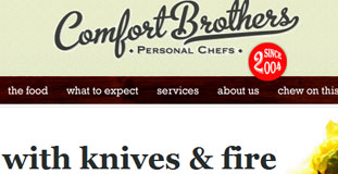
Comfort Brothers
April 19th, 2010 in paper, texture, wood by Green
The details of the textures used in this design are amazing. Comfortbroters.com is the website and blog site of personal chefs.
CONTINUE READING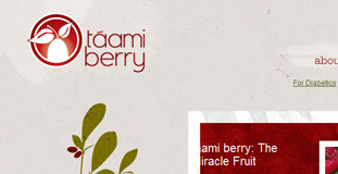
Taami Berry
April 16th, 2010 in illustration, paper, red, texture by Green
Very cool and organic looking layout with excellent use of paper texture and nature illustration. Flavor of Change is a website for the company that sells taami berry.
CONTINUE READING
Gary Nock
April 15th, 2010 in grunge, paper, texture by Green
The design is a little bit grungy with lots of use of paper texture and handwritten typography to complete the effect. Gary Nock is an acoustic singer-songwriter hailing from Walsall in the West Midlands originally.
CONTINUE READING
Bike and Saddle
April 14th, 2010 in brown, paper, texture by Green
Lots of use of paper texture in the design with usual web 2.0 layout. Bike & Saddle is a unique, eco-friendly active holiday (bicycle tours, hiking and multi-sport) company in Cape Town, South Africa, that provides exclusive journeys into Africa.
CONTINUE READING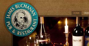
James Buchanan Pub and Restaurant
April 12th, 2010 in brown, paper, texture by Green
Using old paper texture and letterpressed typography the design has a vintage feel. The Jame Buchanan Pub and Restaurant is also a hotel and has been operational since late 1700s.
CONTINUE READING


