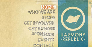
Harmony Republic
March 16th, 2010 in flash, paper, texture by Green
A flash website with amazing use of nature inspired textures made the design look organic and Earth friendly. Harmony Republic is a nonprofit that fosters the development of art by supporting and promoting emerging music, film literature and visual artists who make a positive impact on society.
CONTINUE READING
Sorroundings Factor
March 16th, 2010 in brown, paper, texture, wood by Green
Amazing use of nature inspired textures for a website with a very unique concept. The website comes up with a "Surrounding Factor" based on different things.
CONTINUE READING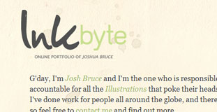
Ink Byte
March 13th, 2010 in illustration, paper, texture by Green
Inkbyte is a portfolio/blog site of of Josh Bruce, a freelance cartoonist and illustrator from Australia. The website designed used a lot of paper texture with stains.
CONTINUE READING
Forty
March 11th, 2010 in green, paper, texture, wood by Green
Very nice design with a unique layout. Great choice of color scheme to use with subtle textures on the design. Forty's a nationally-known and respected marketing agency based in Chandler, Arizona. They offer branding, design, marketing, advertising, and web services to businesses of all sizes
CONTINUE READING
Make It!
March 11th, 2010 in paper, texture, wood by Green
The design used textures a lot particularly wood and paper and made it look great. The cut out photos of landmarks from the cities listed was a nice effect too. Make It is an event in Western Canada where shoppers get the opportunity to buy directly from Canada’s top urban artisans and designers.
CONTINUE READING
Imaginative Traveller Treasure Hunt
March 10th, 2010 in brown, paper, texture by Green
A modern treasure hunt website where participants can win dream vacations to different parts of the world. The design used paper texture to give the effect of using an old treasure map.
CONTINUE READING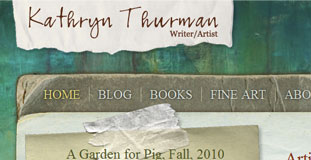
Kathryn Thurman
March 10th, 2010 in grunge, paper, texture by Green
Grunge looking design with colorful color scheme. Lots of use of paper texture and painting effects. This is a homepage for an artist from San Juan Islands.
CONTINUE READING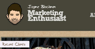
Jayme Blackmon
March 6th, 2010 in illustration, paper, texture by Green
Subtle use of paper texture with minimalistic layout but clean and usable. I’m a self-taught web entrepreneur with ten years of web development and marketing experience.
CONTINUE READING
Rabbit Awareness Week
March 5th, 2010 in green, paper, texture by Green
The font used and the main navigation buttons made the design fun and adorable looking. Rabbit Awareness Week is a week-long annual event held across different parts of U.K. RAW is promoting the proper way of taking care of rabbits and how to keep them healthy.
CONTINUE READING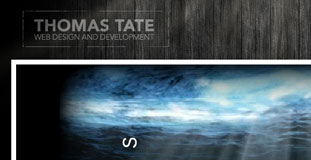
Rethinking Code
March 4th, 2010 in animation, flash, paper, texture, wood by Green
Excellent use of wood and paper textures in the design. The flash animation in the header looks great and gives a very mysterious feel. Rethinking Code is the online portfolio of Thomas Tate, a web designer/developer.
CONTINUE READING
Bez Recepta
March 3rd, 2010 in blue, green, paper, texture by Green
A very well designed e-commerce website with a nature inspired color scheme. The texture in the background gives the website a nice organic feel while the leaves in the header makes gives the website a nice contrast. Bez Recepta is an online store selling products made from organic materials.
CONTINUE READING
Pilates El Paso
February 27th, 2010 in brown, paper, texture by Green
The website design uses paper texture heavily in the design made it look like organic and nature friendly. The photos of dogs begging the visitor to sign-up for the newsletter is a nice touch. The Pilates El Paso Studio specializes in semi and private training which integrates the use of all the apparatus and mat work.
CONTINUE READING


