Spout Creative
February 24th, 2010 in colorful, paper, texture by Green
Simple design that uses crumpled paper texture with light dabs of different color. Spout Creative is a creative design studio located near Los Angeles. They provide a variety of design services including web, print, branding and video production.
CONTINUE READING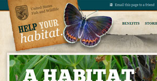
Help Your Habitat
February 23rd, 2010 in brown, paper, texture by Green
Very heavy use of texture on this design but it is done with a purpose and makes the website really look nature friendly and organic. This is a website for non-profit organizations The Partners for Fish and Wildlife Program that teamed up with the Sand County Foundation promote restoration of wildlife with private landowners.
CONTINUE READING
HLMA
February 18th, 2010 in brown, paper, texture by Green
A very nice organic looking website with subtle use of textures. HLMA is a non profit mission ministry. Their mission is to provide every man, woman, and child In Central and East Africa with at least one opportunity to hear the Gospel of Jesus Christ.
CONTINUE READING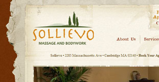
Sollievo
February 18th, 2010 in paper, texture, torn by Green
Great use of texture and web elements that are nature inspired. The torn paper edged texture that served as the content background looks great. Sollievo is a spa that offers massage therapy and acupuncture.
CONTINUE READING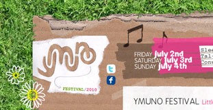
Ymuno Festival 2010
February 17th, 2010 in grass, paper, texture by Green
Lost of use of nature textures in this design gives this design a unique look. The design is also in theme with the topic of the website. Ymuno Festical is a small festival held every year at Sleepy Meadow on the banks of the river Conwy. The festival is all about like minded communities meshing and melting together, having a big knees up and enjoying some great connections, chilled vibe, quality food and fantastic music.
CONTINUE READING
Stop Child Labor
February 12th, 2010 in blue, brown, paper, texture by Green
Very creative design with nature inspired textures and color scheme. The continent of Africa is made to look like it was made from torn paper pieces. Stop Child Labour – School is the best place to work is a joint lobby, education and awareness raising campaign that seeks to eliminate child labour through the provision of full-time, formal and quality education.
CONTINUE READING
Eliminate Paper Time Cards
February 12th, 2010 in brown, paper, texture by Green
This design has a very organic feel to it with lots of use of paper texture in the navigation and background. Eliminate Paper Time Cards is a campaign website to stop using paper time cards and switch to electronic time keeping methods instead.
CONTINUE READING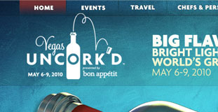
Vegas Uncorked
February 6th, 2010 in blue, green, paper by Green
Excellent design and use of texture. The color scheme is perfect and cool to the eyes. Vegas Uncork'd is the world's most innovative culinary festival held in one of the most dynamic and important culinary destinations in the world.
CONTINUE READING
Osaki
February 5th, 2010 in brown, paper, texture by Green
A simple design and layout, focused in making the website look like it was made out of paper. The organic theme fits the product of this Japanese restaurant based in Colombia offering sushi and other Asian delicacies.
CONTINUE READING
Make the Switch
February 4th, 2010 in brown, paper by Green
This is a campaign website for energy conservation and efficient usage of electricity. The campaign mainly focus on using energy saving light bulbs within our homes. The design uses paper texture heavily and gives it an organic look that goes with the whole theme of the website.
CONTINUE READING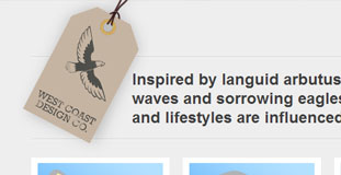
West Coast Design Co
February 2nd, 2010 in illustration, paper, texture by Green
A website for web designers and developers from Canada. Their website is very cleanly designed with a clear layout. There are simple nature illustrations in the background and the use of textures gives the website an organic feel. They claim that their designs and solutions are inspired by nature.
CONTINUE READING
Pearl Harbor
January 30th, 2010 in paper, texture by Green
A website for a World War II airplane fighting game for the Wii. The website is made to look as if it was designed on an old paper. The layout is simple and the two planes flying out of the page is a nice touch.
CONTINUE READING


