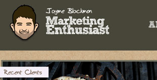
Jayme Blackmon
March 6th, 2010 in illustration, paper, texture by nature-website-gallery
Subtle use of paper texture with minimalistic layout but clean and usable. I’m a self-taught web entrepreneur with ten years of web development and marketing experience.
CONTINUE READING
Rabbit Awareness Week
March 5th, 2010 in green, paper, texture by nature-website-gallery
The font used and the main navigation buttons made the design fun and adorable looking. Rabbit Awareness Week is a week-long annual event held across different parts of U.K. RAW is promoting the proper way of taking care of rabbits and how to keep them healthy.
CONTINUE READING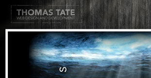
Rethinking Code
March 4th, 2010 in animation, flash, paper, texture, wood by nature-website-gallery
Excellent use of wood and paper textures in the design. The flash animation in the header looks great and gives a very mysterious feel. Rethinking Code is the online portfolio of Thomas Tate, a web designer/developer.
CONTINUE READING
Bez Recepta
March 3rd, 2010 in blue, green, paper, texture by nature-website-gallery
A very well designed e-commerce website with a nature inspired color scheme. The texture in the background gives the website a nice organic feel while the leaves in the header makes gives the website a nice contrast. Bez Recepta is an online store selling products made from organic materials.
CONTINUE READING
Pilates El Paso
February 27th, 2010 in brown, paper, texture by nature-website-gallery
The website design uses paper texture heavily in the design made it look like organic and nature friendly. The photos of dogs begging the visitor to sign-up for the newsletter is a nice touch. The Pilates El Paso Studio specializes in semi and private training which integrates the use of all the apparatus and mat work.
CONTINUE READING
Spout Creative
February 24th, 2010 in colorful, paper, texture by nature-website-gallery
Simple design that uses crumpled paper texture with light dabs of different color. Spout Creative is a creative design studio located near Los Angeles. They provide a variety of design services including web, print, branding and video production.
CONTINUE READING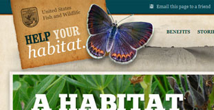
Help Your Habitat
February 23rd, 2010 in brown, paper, texture by nature-website-gallery
Very heavy use of texture on this design but it is done with a purpose and makes the website really look nature friendly and organic. This is a website for non-profit organizations The Partners for Fish and Wildlife Program that teamed up with the Sand County Foundation promote restoration of wildlife with private landowners.
CONTINUE READING
HLMA
February 18th, 2010 in brown, paper, texture by nature-website-gallery
A very nice organic looking website with subtle use of textures. HLMA is a non profit mission ministry. Their mission is to provide every man, woman, and child In Central and East Africa with at least one opportunity to hear the Gospel of Jesus Christ.
CONTINUE READING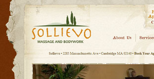
Sollievo
February 18th, 2010 in paper, texture, torn by nature-website-gallery
Great use of texture and web elements that are nature inspired. The torn paper edged texture that served as the content background looks great. Sollievo is a spa that offers massage therapy and acupuncture.
CONTINUE READING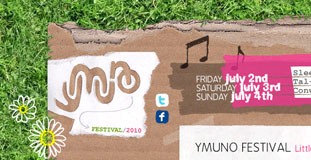
Ymuno Festival 2010
February 17th, 2010 in grass, paper, texture by nature-website-gallery
Lost of use of nature textures in this design gives this design a unique look. The design is also in theme with the topic of the website. Ymuno Festical is a small festival held every year at Sleepy Meadow on the banks of the river Conwy. The festival is all about like minded communities meshing and melting together, having a big knees up and enjoying some great connections, chilled vibe, quality food and fantastic music.
CONTINUE READING
Stop Child Labor
February 12th, 2010 in blue, brown, paper, texture by nature-website-gallery
Very creative design with nature inspired textures and color scheme. The continent of Africa is made to look like it was made from torn paper pieces. Stop Child Labour – School is the best place to work is a joint lobby, education and awareness raising campaign that seeks to eliminate child labour through the provision of full-time, formal and quality education.
CONTINUE READING
Eliminate Paper Time Cards
February 12th, 2010 in brown, paper, texture by nature-website-gallery
This design has a very organic feel to it with lots of use of paper texture in the navigation and background. Eliminate Paper Time Cards is a campaign website to stop using paper time cards and switch to electronic time keeping methods instead.
CONTINUE READING
