Vegas Uncorked
February 6th, 2010 in blue, green, paper by nature-website-gallery
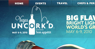
Excellent design and use of texture. The color scheme is perfect and cool to the eyes. Vegas Uncork'd is the world's most innovative culinary festival held in one of the most dynamic and important culinary destinations in the world.
CONTINUE READING
Osaki
February 5th, 2010 in brown, paper, texture by nature-website-gallery
A simple design and layout, focused in making the website look like it was made out of paper. The organic theme fits the product of this Japanese restaurant based in Colombia offering sushi and other Asian delicacies.
CONTINUE READING
Make the Switch
February 4th, 2010 in brown, paper by nature-website-gallery
This is a campaign website for energy conservation and efficient usage of electricity. The campaign mainly focus on using energy saving light bulbs within our homes. The design uses paper texture heavily and gives it an organic look that goes with the whole theme of the website.
CONTINUE READING
West Coast Design Co
February 2nd, 2010 in illustration, paper, texture by nature-website-gallery
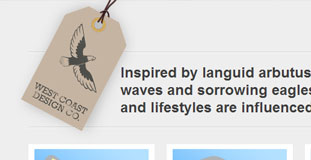
A website for web designers and developers from Canada. Their website is very cleanly designed with a clear layout. There are simple nature illustrations in the background and the use of textures gives the website an organic feel. They claim that their designs and solutions are inspired by nature.
CONTINUE READING
Pearl Harbor
January 30th, 2010 in paper, texture by nature-website-gallery
A website for a World War II airplane fighting game for the Wii. The website is made to look as if it was designed on an old paper. The layout is simple and the two planes flying out of the page is a nice touch.
CONTINUE READING
Team Fannypack
January 29th, 2010 in brown, paper, texture, wood by nature-website-gallery
Lots of use of nature textures in this design. The whole website made to look like an old newspaper. The wood texture in the background completes the effect. The website is for a non-profit organization raising awareness about Multiple Sclerosis.
CONTINUE READING
Rekkiabilly
January 28th, 2010 in brown, paper, texture, wood by nature-website-gallery
A very lively website that used a lot of nature inspired texture in the design. It's a website for an Italian rock band.
CONTINUE READING
Alma Latina
January 28th, 2010 in paper, texture by nature-website-gallery
A website for a Latin dance school in Italy. Uses a very cool color scheme with excellent use of texture in the design.
CONTINUE READING
Adam Woodhouse
January 20th, 2010 in colorful, light, paper, texture by nature-website-gallery
Beautiful and colorful illustration on the header of this portfolio website for a graphic illustrator/web designer from the uk. Very clean and simple layout and the use of textured background complements that design perfectly. The use of jQuery is just right and makes the one page portfolio very usable.
CONTINUE READING
Irvine Acosta
January 19th, 2010 in brown, paper, texture by nature-website-gallery
The design is a little bit experimental with different sizes of type in the navigation. Used a lot of grungy paper texture. A portfolio website for a web designer.
CONTINUE READING
Pat Dryburgh
January 19th, 2010 in cloud, paper, texture by nature-website-gallery
Very clean and simple layout for a blog site with subtle use of texture. The top part of the design has a mix of textured paper with prints of clouds.
CONTINUE READING
Levi Lodge
January 19th, 2010 in brown, paper, texture, wood by nature-website-gallery
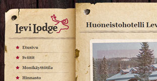
Uses grunge paper texture and wood in the design. The content and navigation area are made to look as if it was nailed in the background and has a very organic feel. This is a website for a lodge in Finland.
CONTINUE READING


