
BimbiSicuramente
June 2nd, 2010 in illustration, texture by Green
A really cool design concept where the illustrated background changes with every page as if the car is driving. The website is about a campaign in Italy about using seatbelts.
CONTINUE READING
Sebastian Mzarek
June 1st, 2010 in illustration, texture by Green
A simple layout that showcases the designer's works using illustrations and canvas textures. Sebastian Mzarek is a graphic artist from Austria.
CONTINUE READING
Walstick
June 1st, 2010 in clouds, texture by Green
Amazing design and layout for an online store with subtle use of nature texture. Walstick is an online store that sells various home items.
CONTINUE READING
Becky Haughton Studio
June 1st, 2010 in illustration, texture by Green
Using illustration and Earth inspired color scheme with a web 2.0 looking layout. Becky Haughton Studio is a hair salon in Colorado.
CONTINUE READING
We Need Backup
June 1st, 2010 in earth, paper, texture by Green
Excellent looking design with a bit of grunge look with mix use of texture and clip art. This is a recruitment website for Intacto, a web design firm from Belgium.
CONTINUE READING
Webnova
June 1st, 2010 in paper, texture, wood by Green
Lots of use of wood and paper textures with a very clean layout design and color scheme. Webnova is a design group from Argentina.
CONTINUE READING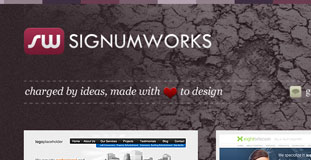
Signum Works
May 29th, 2010 in concrete, paper, texture by Green
A simple portfolio layout with amazing use of various textures all over the design. About SignumWorks is a web design studio established by Tomasz Chmielewski – graphics designer and webdeveloper.
CONTINUE READING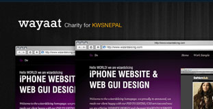
Wayyat
May 29th, 2010 in Clean, texture, wood by Green
A very clean and corporate looking layout with simplistic web elements and subtle use of wood texture. Wayaat.com sells premium wordpress themes.
CONTINUE READING
Susana Loca
May 27th, 2010 in paper, texture by Green
This is a personal website/blog of Susana Loca. The design features illustrations and use of paper texture.
CONTINUE READING
Valter Bicudo
May 27th, 2010 in dark, texture, wood by Green
A very simple layout with minimal use of wood texture but still an eye-catching design. This is a one-page layout portfolio of Valter Bicudo, a desiner from Brazil.
CONTINUE READING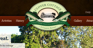
Clover Cottage
May 27th, 2010 in texture, wood by Green
Excellent use of wood texture with high detailed web elements. Clover Cottage is a farm in western Australia that is open to tourist.
CONTINUE READING
Flaviz
May 26th, 2010 in grunge, paper, texture by Green
The website used a grunge paper texture for the main background of the design composed with nature photography. This is a portfolio for a web designer based in Brazil.
CONTINUE READING


