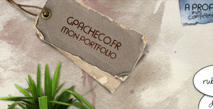
Portfolio de Guillaume Pacheco
May 6th, 2010 in cliparts, paper, texture by Green
Amazing and very creative design with lots of use of nature inspired texture and very rough animation in the homepage. This is the portfolio website of Guillaume Pacheco, a web designer and graphic artist.
CONTINUE READING
Trendy Web Design
May 6th, 2010 in paper, texture by Green
Lots of creative use of paper texture in the design especially on the form in the footer. Nilarian Trendy is the web design portfolio of professional freelance web designer and flash designer Niloufar Motallebi.
CONTINUE READING
Tony Johnson
May 6th, 2010 in single page, texture, wood by Green
A single page layout for a portfolio website. Uses a lot of wood texture for the background of the main content.
CONTINUE READING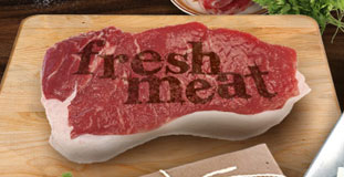
Jonathan Patterson
May 6th, 2010 in clip arts, texture, wood by Green
Nice use of photo cliparts for a realistic feel using a dark color scheme. Fresh Meat is the portfolio of Jonatahn Patterson.
CONTINUE READING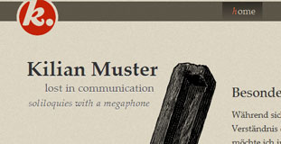
Kilian Muster
May 4th, 2010 in illustration, texture, typography by Green
The design features very clean typography and layout design with subtle use of texture. A really cool and classic looking illustration is displayed in the homepage. Kilian Muster, a typographer from Germany living and working in Tokyo in the field of visual communication & user experience.
CONTINUE READING
Crush Loverly
May 4th, 2010 in paper, texture by Green
Interesting use of different textures on an interesting layout. Crush + Lovely is a web design and development agency.
CONTINUE READING
All Things Old Timey
May 3rd, 2010 in illustration, paper, texture by Green
Really cool looking vintage texture and illustration in the design. All Things Old Timey is a design blog that features vintage themed websites.
CONTINUE READING
Elegant Web
May 3rd, 2010 in paper, texture by Green
Simple layout with a paper texture all over the background. and wood texture in the buttons. Elegantweb is a web design company from India.
CONTINUE READING
Sam Taylor
May 3rd, 2010 in paper, texture by Green
Slight grunge paper texture all over the site with a humorous content. This website is the portfolio/resume website of Sam Taylor.
CONTINUE READING
Matthew and Sara
May 3rd, 2010 in illustration, texture, vintage by Green
Lots of vintage looking textures used in the design with a few illustrations of nature elements. This is a wedding website for Mather and Sara, a couple from Oklahoma.
CONTINUE READING
ConvergeSE
May 2nd, 2010 in illustration, texture by Green
A really eye-catching illustration in the front page and lots of use of texture in the design. ConvergeSC is a conference in Columbia, South Carolina for web professionals.
CONTINUE READING
We Are Scams
May 2nd, 2010 in illustration, texture by Green
Lots of use of organic texture mixed with hand written web elements makes this design organic looking. Scams are a northern English rock ‘n’ roll electronica band from Chester. The band consists of Andy Morgan, Tom Hyndman, Paul Bunker and Sean Howe.
CONTINUE READING


