namastec
February 3rd, 2010 in black, brown, illustration, texture by Green
Namastec is a website design and development services company located in Nebraska. They offer various services like customized web design, development, and web marketing solutions. The design uses a dark color scheme with brown and black. Subtle use of nature related textures on the design.
CONTINUE READING
Armcom
February 2nd, 2010 in tabletop, texture, wood by Green
Nice design with a simple layout. Websites laid out on top of a table are slowly becoming a trend. The simple animation gives the design some life and interest. They are a team of young designers from Bedford.
CONTINUE READING
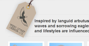
West Coast Design Co
February 2nd, 2010 in illustration, paper, texture by Green
A website for web designers and developers from Canada. Their website is very cleanly designed with a clear layout. There are simple nature illustrations in the background and the use of textures gives the website an organic feel. They claim that their designs and solutions are inspired by nature.
CONTINUE READING
Pearl Harbor
January 30th, 2010 in paper, texture by Green
A website for a World War II airplane fighting game for the Wii. The website is made to look as if it was designed on an old paper. The layout is simple and the two planes flying out of the page is a nice touch.
CONTINUE READING
Sheldon Farm Baskets
January 30th, 2010 in brown, texture, wood by Green
Sheldon Farm Baskets produces handmade farm baskets. They offer handpainted baskets as well as baskets with dyed reed. The baskets come in a variety of shapes and sizes and may be custom designed to include a painting or design of your choice. The design has a nice feel to it because of the proper use of textures. The layout is simple and easy to navigate.
CONTINUE READING
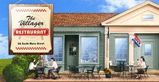
Villager Restaurant
January 29th, 2010 in illustration, texture, wood by Green
A website for a restaurant in Kent, Connecticut. They offer breakfast and brunch meals as well as Mexican dishes. The design has a nice illustrated nature landscape in the background and the header is an illustration of their restaurant. The design also used some wood and ribbon texture.
CONTINUE READING
Team Fannypack
January 29th, 2010 in brown, paper, texture, wood by Green
Lots of use of nature textures in this design. The whole website made to look like an old newspaper. The wood texture in the background completes the effect. The website is for a non-profit organization raising awareness about Multiple Sclerosis.
CONTINUE READING
Rekkiabilly
January 28th, 2010 in brown, paper, texture, wood by Green
A very lively website that used a lot of nature inspired texture in the design. It's a website for an Italian rock band.
CONTINUE READING
Alma Latina
January 28th, 2010 in paper, texture by Green
A website for a Latin dance school in Italy. Uses a very cool color scheme with excellent use of texture in the design.
CONTINUE READING
Foxtie
January 27th, 2010 in black, brown, illustration, texture by Green
A beautifully designed website with crisp design elements and excellent use of textures with a very user friendly layout. The design also features character illustrations. They are a design agency specializing in the creation of interactive websites, unique brands, crisp print material, and innovative marketing campaigns.
CONTINUE READING
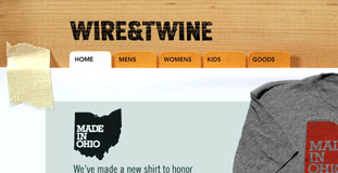
Wine and Twine
January 26th, 2010 in shirts, texture, white by Green
A site that sells shirts that has cool and tech related prints. They have shirts that will really look great on geeks and other tech enthusiast. The site design has subtle use nature related textures and the masking tape and paper tabs gives a nice touch of realism to the design.
CONTINUE READING
Savaya Coffee Market
January 25th, 2010 in brown, green, photo, texture by Green
A splash page for an upcoming website that has photos of nature elements as well as nature inspired textures in the design. The are a coffee producing company from Tucson that offers only organic coffee beans.
CONTINUE READING


