
Industry Forge
January 25th, 2010 in black, brown, texture by Green
Crisp and clean design elements with subtle use of textures and nature related color scheme. They are a web design firm from Utah specializing in SEO ready and search engine friendly web designs.
CONTINUE READING
Blogfullbliss
January 24th, 2010 in grass, texture, wood by Green
A portfolio website of a web designer also a blog that deals with tutorials, design trends and other related topics. The design uses various nature inspired texture beautifully.
CONTINUE READING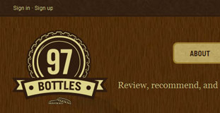
97 Bottles
January 22nd, 2010 in brown, texture, wood by Green
A social networking site where everyone can sign up and post a review and learn more about their favorite bottle of beer. The design uses a very organic color scheme with large wood texture at the background.
CONTINUE READING
Modstudio
January 21st, 2010 in dark, green, texture, wood by Green
Minimalistic layout design with excellent use of nature texture. The site also has a nice composition of nature photos in the homepage. A portfolio website for a web designer in Argentina, he offers web design, photography and logo design.
CONTINUE READING
Comedy Corner
January 21st, 2010 in brown, texture, wood by Green
A one page website for the opening and ticket reservation of a comedy bar in Belgium. Simple layout with nice use of wood and textile texture.
CONTINUE READING
Adam Woodhouse
January 20th, 2010 in colorful, light, paper, texture by Green
Beautiful and colorful illustration on the header of this portfolio website for a graphic illustrator/web designer from the uk. Very clean and simple layout and the use of textured background complements that design perfectly. The use of jQuery is just right and makes the one page portfolio very usable.
CONTINUE READING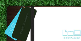
Christina Lauer
January 19th, 2010 in grass, green, texture by Green
A small content area in the center of grass texture. Each link opens up a new page which could have been done easier with jquery. The simplistic design and layout makes the website looks nice.
CONTINUE READING
Irvine Acosta
January 19th, 2010 in brown, paper, texture by Green
The design is a little bit experimental with different sizes of type in the navigation. Used a lot of grungy paper texture. A portfolio website for a web designer.
CONTINUE READING
Pat Dryburgh
January 19th, 2010 in cloud, paper, texture by Green
Very clean and simple layout for a blog site with subtle use of texture. The top part of the design has a mix of textured paper with prints of clouds.
CONTINUE READING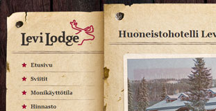
Levi Lodge
January 19th, 2010 in brown, paper, texture, wood by Green
Uses grunge paper texture and wood in the design. The content and navigation area are made to look as if it was nailed in the background and has a very organic feel. This is a website for a lodge in Finland.
CONTINUE READING
Luthier Services
January 19th, 2010 in brown, texture, wood by Green
Excellent use of wood texture with inset deign elements and type. They even used wood inspired social media icons which completes the theme of the design. They are a string instrument making company.
CONTINUE READING


