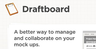
Draftboard
September 1st, 2010 in paper, texture, web 2.0 by nature-website-gallery
A very clean and simple web design with highly detailed web element and subtle use of paper texture. Draftboard is a collaboration tool made by designers for designers.
CONTINUE READING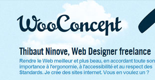
Woo Concept
May 18th, 2010 in clouds, web 2.0 by nature-website-gallery
Very simple and web 2.0 looking design and layout with minimal use of nature textures. WooConcept is the portfolio website of the freelance web designer Thibaut Ninove.
CONTINUE READING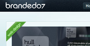
Branded 07
April 16th, 2010 in illustration, web 2.0 by nature-website-gallery
Highly detailed web elements and excellent looking layout. Beautiful illustration of nature elements specially in the footer. Branded 07 is Rob Palmer's portfolio and blog website, a web & graphic designer based in Newcastle-upon-Tyne.
CONTINUE READING
Kingdon Global
March 30th, 2010 in gray, web 2.0, white by nature-website-gallery
Very nice details on various web elements with excellent use of colors. KGM looks for leaders with big vision and becomes a relational resource to them by mentoring, resourcing, and releasing.
CONTINUE READINGPixel Tree
March 21st, 2010 in green, illustration, web 2.0 by nature-website-gallery
Nice web 2.0 style layout with beautiful illustration of nature. Located in sunny Florida, Pixel Tree is a boutique multimedia design studio that takes great pride in providing unique advertising and web solutions.
CONTINUE READING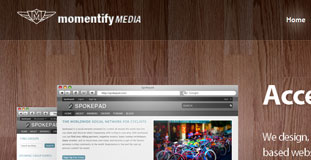
Momentify
March 18th, 2010 in texture, web 2.0, wood by nature-website-gallery
Really cool design with high detailed web elements and textures. Momentify is a web design agency based in New York.
CONTINUE READING
The Big Design Conference
March 10th, 2010 in clouds, illustration, web 2.0 by nature-website-gallery
The Big Design Conference focuses on Strategy, Social Media, User Experience, and Code Development. A two day event designed to be fun, informative, and checkbook friendly. The site is built using Wordpress with a custom nature theme and integrated shopping cart.
CONTINUE READING
Hoodia Weightloss
March 9th, 2010 in green, illustration, web 2.0 by nature-website-gallery
Hoodia Weight Loss is a fresh and modern approach to online dieting. The vivid colours, well coded xhtml/css make this an SEO dream and a well design static website.
CONTINUE READING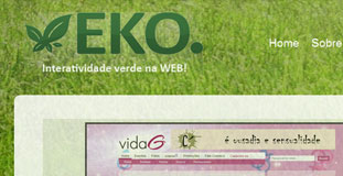
EKO Agency
March 6th, 2010 in grass, texture, web 2.0 by nature-website-gallery
A very web 2.0 style layout with large grass texture in the background. EKO is a design agency from Brazil.
CONTINUE READING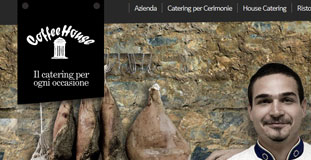
Coffeehouse
March 5th, 2010 in black, photogra[hy, web 2.0, white by nature-website-gallery
The Coffeehouse website has a simple web 2.0 style layout and using just black and white colors with large photography of nature elements. Coffee House is a young company that operates in the catering services and catering for over five years.
CONTINUE READING
Smooth Step Design
January 13th, 2010 in CSS, development, web 2.0, Web Design by nature-website-gallery
This is our 3.0 version of the site. It has minimalistic CSS/xHTML design enhanced with funky Flash based alpha layer animations. Te idea was to make the site as dynamic as possible so when a new page is added its relevant content is reflected in other pages automatically.
CONTINUE READING
