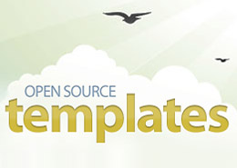
Innovation Germany
March 13th, 2010 in Clean, earth, white by nature-website-gallery
A website with very clean layout and design. The flash slideshow makes the website come alive and the simple earth graphic was a nice touch. Innovation Germany is a website dedicated to a number of fascinating events on innovation and Germany.
CONTINUE READING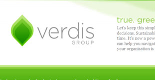
Verdis Group
March 9th, 2010 in green, simple, white by nature-website-gallery
Simple and well executed website design with great typography and usability. The Verdis Group is a consultancy agency that help organizations make true green decisions.
CONTINUE READING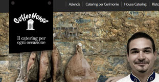
Coffeehouse
March 5th, 2010 in black, photogra[hy, web 2.0, white by nature-website-gallery
The Coffeehouse website has a simple web 2.0 style layout and using just black and white colors with large photography of nature elements. Coffee House is a young company that operates in the catering services and catering for over five years.
CONTINUE READING
Celestial Grace
March 5th, 2010 in Purple, white, zen by nature-website-gallery
Using a high contrast color scheme, the design is full of zen themed photos and nature elements. The site design also has nicely detailed web elements. Celestial Grace is a Holistic Consultancy business that specialises in teaching the art of positive thinking and living.
CONTINUE READING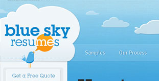
Blue Sky Resumes
March 4th, 2010 in animation, blue, clouds, white by nature-website-gallery
This website is well designed, the web elements have crisp details. The animated clouds looks great and the typography of the layout was well done. Blue Sky Resumes offers creation of unique resumes.
CONTINUE READING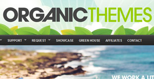
Organic Themes
March 2nd, 2010 in blue, illustration, white by nature-website-gallery
This design was beautifully executed with great details on the web elements and illustration in the background. Aloha, Organic Themes is a complete WordPress theme solution company founded in the remote town of Lahaina on the Hawaiian Island of Maui.
CONTINUE READING
Logic Source
February 27th, 2010 in blue, photography, white by nature-website-gallery
This site uses different large and great looking photos of nature for the background which changes in every section of the website. LogicSource is a procurement management firm they focus exclusively on the procurement of printed materials and related commodities and services.
CONTINUE READING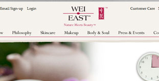
Wei East
February 26th, 2010 in cream, texture, white by nature-website-gallery
Using a low contrast color scheme made their logo stand out more. The painted effect on the borders of the content windows of the design give the website a very organic and nature friendly feel. Wei East is an online store that sells traditional Chinese herbal medicine.
CONTINUE READING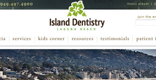
Island Dentistry
February 26th, 2010 in green, illustration, white by nature-website-gallery
Very nice and well done design and the illustration of plants in the background looks great. The page curl on the upper left hand of the screen was a nice touch also. Island Dentistry is a unique and innovative dental practice located on Pacific Coast Highway in beautiful Laguna Beach
CONTINUE READING
Vancouver 2010
February 25th, 2010 in blue, illustration, white by nature-website-gallery
A very colorful and amazingly organized layout and design. Really cool looking action illustrations in the background. This is the official website of the 2010 Winter Olympics being held at Vancouver, Canada.
CONTINUE READING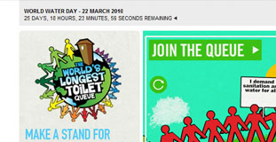
Worlds Longest Toilet Queue
February 24th, 2010 in animation, gray, illustration, white by nature-website-gallery
The design uses primarily white and gray colors while using vibrant colors on the animation and buttons to help visitors focus. The World’s Longest Toilet Queue is a mass mobilisation event and Guinness World Record attempt. They demand real change regarding resolving water crisis and global sanitation.
CONTINUE READING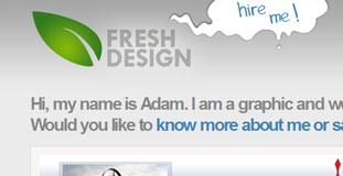
Fresh Design
February 23rd, 2010 in gray, leaf, white by nature-website-gallery
Minimalistic design with a low contrast color scheme. This is a portfolio website for a graphic designer based in Denmark. The simplicity of this one-page portfolio makes it effective and his logo stands out on the layout
CONTINUE READING
