Haskel Sears Design
February 20th, 2010 in brown, texture, wood by nature-website-gallery
A minimalistic designed website with a slideshow of beautiful photography. The wood texture in the background is a very nice fit for the company that owns this website. Matt Sears founded Haskel Sears Design in Chattanooga, in 2005. Building upon a decade of experience in wood craft and design, every Haskel Sears piece is constructed around the nature and possibilities of wood.
CONTINUE READING
Nic Brunson
February 19th, 2010 in texture, wood by nature-website-gallery
This is a portfolio website for Nic Brunson, a freelance web designer. The dark grayscale wood texture in the background was gives a very artistic touch to the design and the bright colors used is a nice contrast.
CONTINUE READING
Master of Malt
February 17th, 2010 in brown, texture, wood by nature-website-gallery
Great use of textures in this design with a very usable layout. The two textures used really goes well together and fits the theme of the site. Master of Malt is a whisky retailer for 25 years.
CONTINUE READING
dzucle
February 15th, 2010 in brown, dark, texture, wood by nature-website-gallery
This design has great use of texture and illustration. The web elements are crisp and nicely done and color scheme used is perfect for the theme. Dzucle is a portfolio website for a web designer from Hanoi, Vietnam.
CONTINUE READING
Copper Basin Construction
February 12th, 2010 in brown, texture, wood by nature-website-gallery
Copper Basin is a construction company that started building homes in 1995. Copper Basin's current focus is the Inland Northwest, with communities throughout the Eastern Washington and North Idaho region. The design looks with great with the balanced use of wood and paper texture
CONTINUE READING
Bills
February 10th, 2010 in iphone app, texture, wood by nature-website-gallery
Very sleek and smooth designs with highly detailed texture. Bills is an iPhone bill tracking app, the effect of your bills being laid out on a wooden table is one of the main feature of this app.
CONTINUE READING
Electric Pulp
February 5th, 2010 in brown, texture, wood by nature-website-gallery
Amazing design with an impressive layout. The whole site mas made to look like it was made on wood. Electric pulp is a web design and development studio with an impressive list of clients and portfolio.
CONTINUE READING
Armcom
February 2nd, 2010 in tabletop, texture, wood by nature-website-gallery
Nice design with a simple layout. Websites laid out on top of a table are slowly becoming a trend. The simple animation gives the design some life and interest. They are a team of young designers from Bedford.
CONTINUE READING
Sheldon Farm Baskets
January 30th, 2010 in brown, texture, wood by nature-website-gallery
Sheldon Farm Baskets produces handmade farm baskets. They offer handpainted baskets as well as baskets with dyed reed. The baskets come in a variety of shapes and sizes and may be custom designed to include a painting or design of your choice. The design has a nice feel to it because of the proper use of textures. The layout is simple and easy to navigate.
CONTINUE READING
Villager Restaurant
January 29th, 2010 in illustration, texture, wood by nature-website-gallery
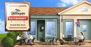
A website for a restaurant in Kent, Connecticut. They offer breakfast and brunch meals as well as Mexican dishes. The design has a nice illustrated nature landscape in the background and the header is an illustration of their restaurant. The design also used some wood and ribbon texture.
CONTINUE READING
Team Fannypack
January 29th, 2010 in brown, paper, texture, wood by nature-website-gallery
Lots of use of nature textures in this design. The whole website made to look like an old newspaper. The wood texture in the background completes the effect. The website is for a non-profit organization raising awareness about Multiple Sclerosis.
CONTINUE READING
Rekkiabilly
January 28th, 2010 in brown, paper, texture, wood by nature-website-gallery
A very lively website that used a lot of nature inspired texture in the design. It's a website for an Italian rock band.
CONTINUE READING


